new
All Plans
UI & Reporting
Pivot Table
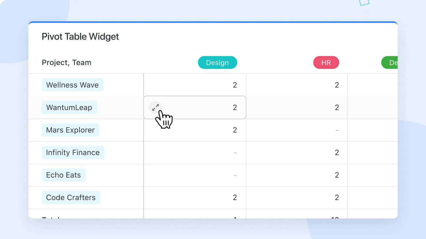
SmartSuite's Pivot Table widget is a powerful tool that helps you transform large, complex datasets into clear and actionable insights. By organizing your data into rows and columns, the Pivot Table allows you to analyze and compare different aspects of your information, making it easier to answer specific business questions.
Use
Cases
:- Sales Analysis:Track sales performance across different regions to identify which areas are driving the most revenue.
- Project Management:Compare timelines, track tasks, and analyze project performance across teams efficiently.
- Customer Feedback:Evaluate customer satisfaction scores across various service teams to identify strengths and areas for improvement.
How to Use the Pivot Table Widget:
1.
Add Widget:
Start by clicking "Add widget" on your dashboard.2.
Select Pivot Table:
From the Widget Library, choose "Pivot Table."3
. Choose Data Source:
Link the widget to the appropriate solution and table that contains the data you want to analyze.4.
Configure Rows and Columns:
Define the fields that will be displayed in the rows and columns of your pivot table, allowing you to structure your data for easy analysis.5.
Summarize Data:
Choose how you want to summarize your data—whether by counting occurrences, calculating totals, or using another aggregation method.By visualizing your data in this structured way, you can quickly grasp critical insights that drive your strategic goals. The Pivot Table widget is particularly useful for professionals who need to dissect data from different perspectives, helping them uncover trends, identify gaps, and make informed decisions.
This feature is available for
All Plans
.