improved
Heatmap Chart Enhancements
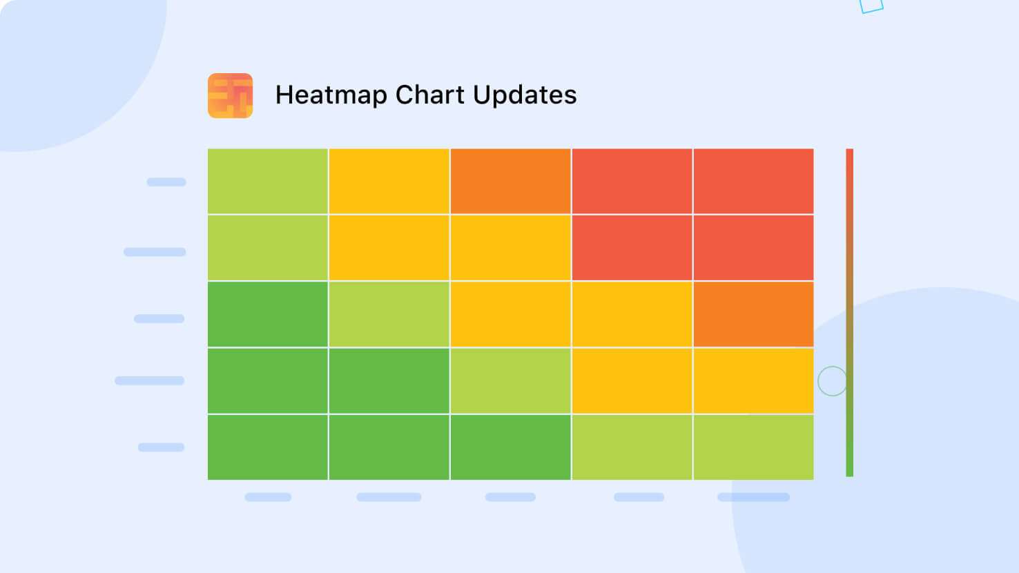
Several enhancements have been made to SmartSuite's Heat map Chart type, aimed at improving its data visualization capabilities. These updates include consistent sorting, display of drill-in enabled values within segments, and a refined color scale that better highlights values. Additionally, the X and Y axis sort order can be configured, and each axis is labeled with the field name of its source data.
To create a heat map chart, add a new Chart View to your table and select Heat map Chart in the chart settings section. You can then select a field to provide values for the cells, as well as fields that define the heat map’s X and Y axis. Adjust the sort direction by selecting First to Last or Last to First in the dropdown for each axis.